A cup of eternity
Devlog#4: GUI and music for A cup of eternity
Welcome to the fourth devlog of A cup of eternity, an O2A2 2025 jam visual novel! In these, I plan to cover each week a different aspect of developing for this game, to keep a trace for posterity. These will be separated into several parts:
- Devlog#1: Writing & origin story
- Devlog#2: Char design
- Devlog#3: Staging and background
- Devlog#4: GUI and music
- Devlog#5: Final hours
I am also pleased to announce that we will also do an extended version of A cup of eternity for SuNoFes 2025 jam (September 2nd), with planned VA and translation possibly, and other improvements in the works. So please stay tuned and follow, rate and comment on our game if you liked it!
1/ How complex do you want it to be? Yes.
…How I actually got our GUI artist on board.
Throughout the 10 days jam, GUI went through several iterations before final version, which we will see below.
2/ Main menu
A very early concept sketch of the main menu showed the two characters sitting at the table, framed by the window, with the cold moonlight illuminating the scene from behind. The love knot element for menu buttons was already there, but it got reused in the quick menu instead later.
Early main menu concept with bokeh FX
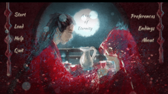
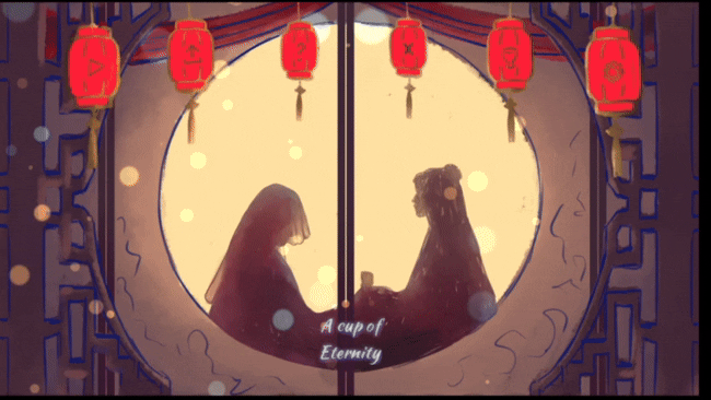
This got quickly abandoned in favor of a second version, this time a view from the exterior of the room with swaying lanterns, which is the one that finally got implemented. First version would have needed too much time and effort to render on top of all the other art assets needed given the limited timeframe of the jam. Second version was more dynamic and the shape of each element was clearer and more distinctly separated from each other.
Again, I quickly rendered a placeholder from the GUI artist's early sketch in order to start coding it in it and adding animations, imagebuttons, shaders and screen transition while waiting for the final asset to save time.
Second main menu placeholder rendered from GUI artist’s WIP sketch

Final main menu as rendered by GlasswingGames
3/Quick menu GUI
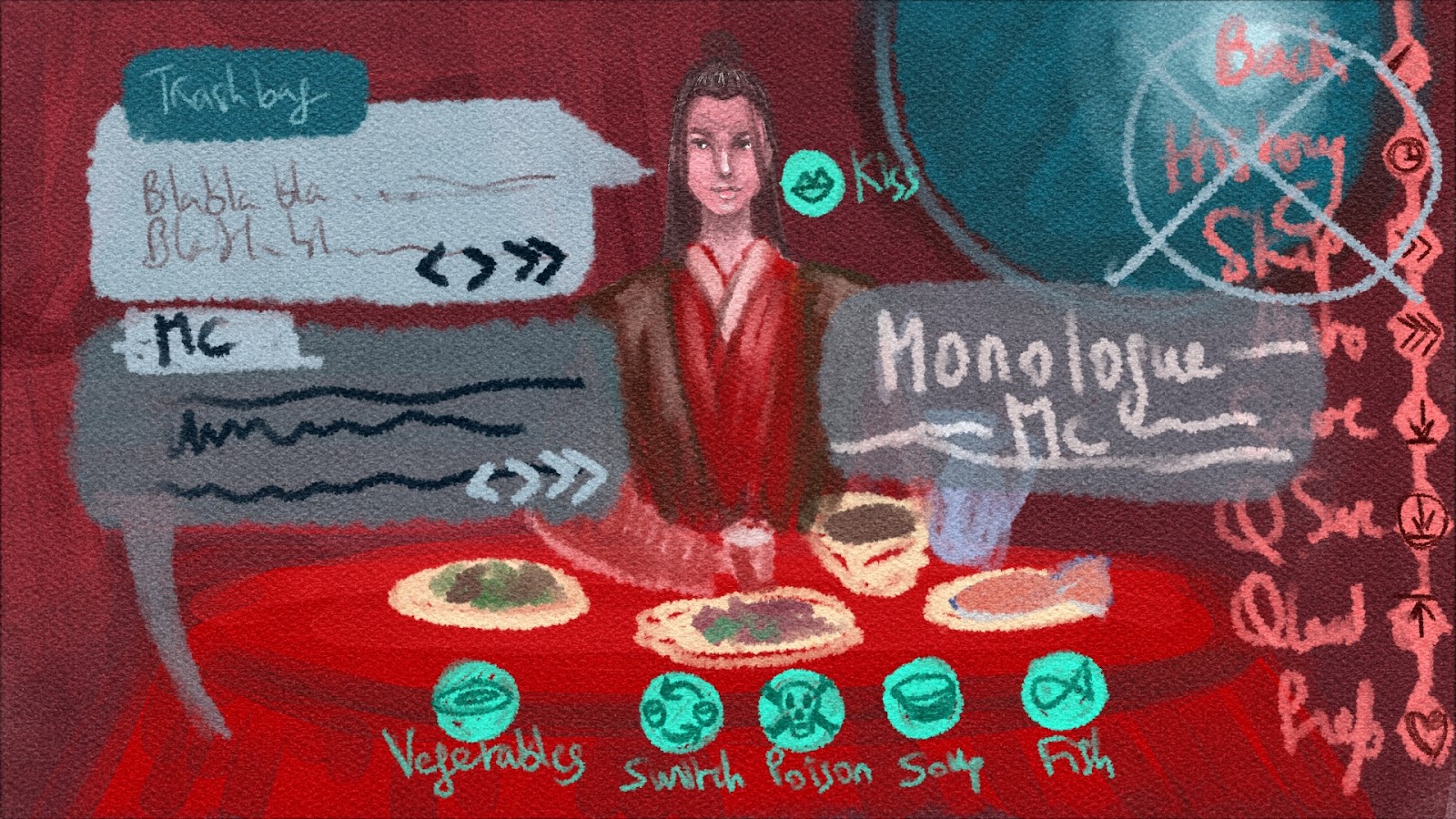
Very early on, I knew I didn’t want a textbox at the bottom since the central element was the table which had to be visible for poisoning shenanigans purposes, hence we went for dialogue & narration bubbles instead. We also needed several custom buttons related to player actions (poison, eat, feed) which needed to appear later in the game.
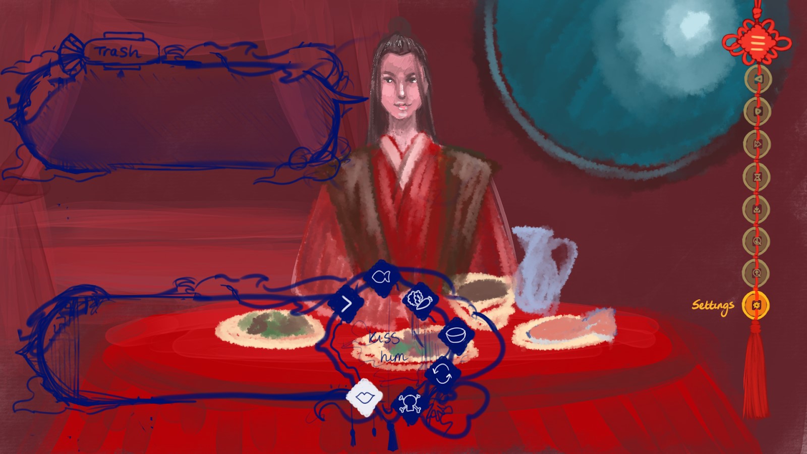
First quick menu concept sketch along with bubbles and BG/Sprite placeholders
In this very first concept sketch of ingame interface (the big placeholder BG wasn’t even done at that point), the screen was quite busy with too many buttons and colors going on.
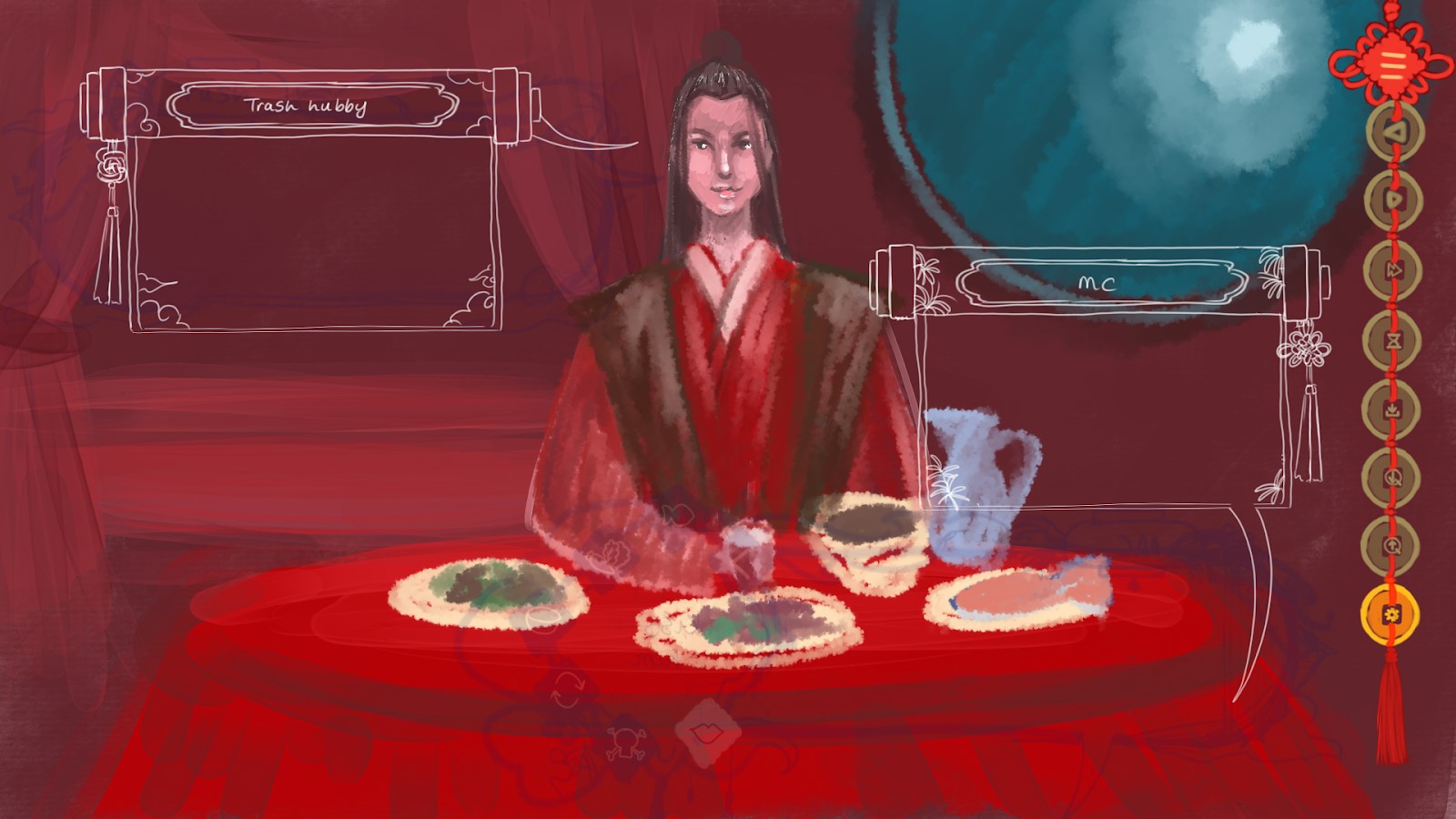
Second version of ingame interface that got considerably cleaned up
Second version as you can see above was much cleaner but there were still too many buttons, which made MC’s bubble quite heavy and bulky. Moreover, the clouds around the bubbles would have gotten deformed quite badly when stretched to adjust to the text later. This design would have worked if the bubbles stayed the same size throughout the story.
Quick menu buttons were made in the shape of old Chinese coins attached to a love knot. However, although it was aesthetically pleasing to have the icons contained within the square hole of the coins, they were a bit too small here and hard to see.
The final choice was to fully separate the poison-related buttons from the bubbles and put the other action buttons such as eat/feed dishes into a regular choice menu for simplicity. Quick menu buttons would also be hidden and shown through a drop-down menu to reduce space taken on-screen.
Third version with new bubbles test
Third textbox design was suited for rescaling but a bit too boxy, so we went for the fourth version as seen below with other placeholders, which is the shape that finally got rendered for the final asset. The lattice pattern in the bubbles is also visually coherent since it can be found on the main menu and the window in the room.
 Fourth version layout test with other placeholders
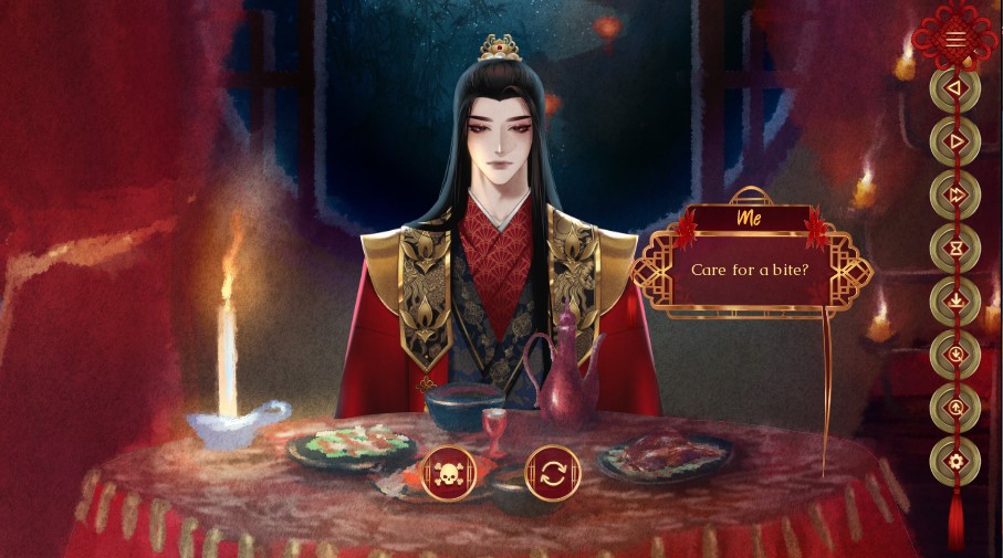
Final interface as seen ingame
As you can see, sprite and background also evolved quite a bit throughout this, along with the textbox and menu changes. The bright saturated fire red from the beginning got replaced by colder and more desaturated hues and then there was a final shift to warm everything back up with more red and purple and upping the contrast and saturation in the final version. Layers are your best friend here for color correction without having to redraw everything by hand...
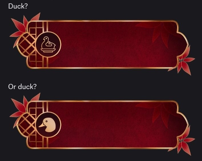
4/ Ingame menu and the search for the perfect duck
The ingame menu design was relatively straightforward compared to the other ones since it came last. Several elements from the other menus, like the love knot and coins from the quick menu and lantern from the main menu were reused for buttons. The third version of the bubbles which didn't get selected was also adapted as a scroll for the history menu and other pop ups. Nothing was truly lost in the end, designs got transformed and reused elsewhere eventually...
One thing we spent a little more time on towards the end were the icons for the endings menu, which were all different for each ending, and more specifically, the duck one. Yup, priorities...
Which duck shall it be?
That is the question
And finally our adorable duck of death was born:
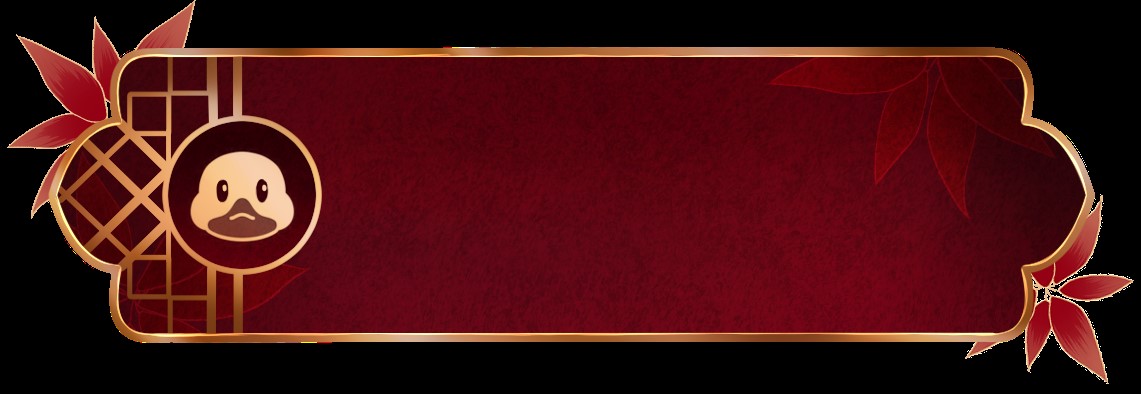
Look here, isn't he cute? It would be a crime to eat him. Surely you wouldn't... right?
5/ Music
For music, the aim was to keep it sounding traditional, with a focus on guzheng. It had to be not too fast nor too slow, like the speed of a flowing conversation, allowing for breaths of silence and pauses in-between the notes. It wasn't easy for the composer since there were several different moods throughout the game: cheerful and careless wedding music at the beginning, calmer during conversations, tense during choices, sad and somber for bad endings... but O2A2 rules allowed only one track which had to contain them all.
One way we solved this was to do one big track made up of several segments which were variations on the same theme, where each segment could be played individually via code with timestamps when needed.
Afterword
And with this, we're done for today. Thanks for reading (or scrolling until here), hope you enjoyed looking at the various ugly stages game went through before final version!
Please stay tuned for Devlog#5 next week, where we'll get to the behind-the-scenes story of the final hours of the jam. As jams near the end, final hours are always the highest in emotions and twists, but even more so in this one...
One last message from Fujun:
Perhaps not a sip of a cup of eternity though... Don't trust that two-faced pixel man on this one... See you next time!
Comments
Log in with itch.io to leave a comment.
Have you gone over the code for your game? I really love how the gui was built but could only guesstimate what code was used.
Hi momo, depends on what aspect you're interested in specifically?
For the lantern sway on main menu, it was a custom shader by yours truly. Actually, for a previous project (The Man of my Dreams), I had already coded a custom grass sway shader. So the lanterns swaying was basically taking that grass shader (top moves, bottom of the image stays fixed) and reversing everything. Formula consists of quite a few cos and sin strewn around and playing with them until it looks right.
For custom menu buttons, it's about replacing textbuttons from default menu code by imagebuttons and adding actions to them depending on how you want them to react (cf official Ren'Py documentation for the syntax).
Thank you. I'm currently learning shaders myself and it's nuts how you did it lmao.
edit: though what I meant was the animation after imo. Did you use a label for that transition or another screen?
Not me answering 2 months later... I didn't get the notification since it was an edit to your original answer.
Transition was done via show screen inside a regular label + renpy.pause to wait for the doorslide animation to end + hide screen after. You can perform ATL inside the screen.